Non Volatile Technologies Pty Ltd

BALLINA  AUSTRALIA   2478    (ABN 69 105 479 954)    Ph:+61 2 9016 4695 

"Helping others to have a future assures our own."

EXPLANATION OF THE COMMON APPLICATION front-end (CAFÉ) STANDARD


EXECUTIVE SUMMARY

Opening screen of a CAFE compliant document.  The LogOn Screen.

The Beginning Of CAFE

CAFÉ is an essential "enabler"; making cost affordable and feasible a systems acquisition and development concept that consists of a distributed topology comprised of applications written, if necessary, by a large number of independent contractors; each application exchanging data with others on an as-needs basis when communications permit.  This approach has many strategic and tactical advantages and, most importantly, provides the best possible systems solution at the lowest, most competitive price.

CAFÉ contributes to this ultimate objective by providing the means by which it is possible, with minimal effort, to develop a suite of applications, serving the multi-various needs of business units.  By insisting that contractors use CAFÉ, all applications will exhibit a common look and feel, regardless of the fact they may have been developed by different programming teams owned by different contracting companies.  In the past, to achieve this common look and feel, the approach adopted by conventional thinkers has been to reduce the number of different applications running within a business which inevitably leads to the adoption of Enterprise Resource Planning(ERP) applications.  Because of the high level of entry traditionally necessary to participate in the ERP application market, this approach translates to only using the products of a few vendors; all of which are usually “big” names in the IT industry. This reduction of vendors results in the delivery of systems that do not represent good value for money by any measure whatsoever.  The main causes of this are limited competition and the limited diversity of intellect caused by only having a few companies participating in the innovative process of application creation/development. 

In all, the benefits that result from requiring all applications conform to the CAFÉ standard may be summarised as follows:

  • minimal training;
  • high clerical productivity by minimise the effort needed to perform data input;
  • reduced probability of erroneous input;
  • the ability to employ many different contractors yet end up with applications that all exhibit the same look and feel, giving the perception to users the applications all belong to one coherent system;
  • greater choice of contractors resulting in better value for money through open competition; and
  • broader base of contracted intellect resulting in a better chance of arriving at innovative, superior solutions.

Lastly, because CAFÉ uses tried and tested routines to generate the forms described in this paper, program development is faster and there are fewer errors in the resultant source code.

INTRODUCTION

General

  1. The acronym CAFÉ1 is an acronym within an acronym, that is:

    1. Common Application Front End, is primarily enabled by use of a

    2. Common Application Form Environment.

  2. When used in the context of sub-para a.  above, CAFÉ's aim is not only to to provide a standard, useful to programmers for the production of easy-to-use, efficient forms, but also to couple these forms to a standard Open Source database engine such as FirebirdSQL or PostgreSQL.  It should be noted that although the front-end of the CAFÉ demonstration application, at the time of writing, uses Microsoft Access and Microsoft's Visual Basic for Applications, the principles are transportable into any other mainstream programming language, for example, C, Python, Java and Delphi (Pascal).  Used in the context of b.  above, CAFÉ is a form standard, to be followed by all applications developers producing applications for any company, and provides a guide as to how software should be written such that the code is unambiguous and easy to maintain by successive contractors.

  3. The intention of CAFÉ forms is that they are:

    1. easy for a user to learn to use,
    2. efficient in terms of the clerical effort and time necessary to enter data into the form, and
    3. minimise the likelihood of input error.
  4. The logic underpinning CAFÉ is that, if all applications were to be developed to this standard, users would perceive that disparate applications, written by numerous agencies and/or authors, were integrated components of one whole system.  Additionally, once a user had learnt to use the forms in one application, they would require very little training to use any other application that employed the CAFÉ standard.

  5. As mentioned, at the time of writing, an example of a CAFÉ compliant program, called CAFEDemo, has been written in Microsoft Access.  This application connects to a FirebirdSQL database.  A separate application has been developed, over a period of 18 months, for automatically migrating a Microsoft Access Jet DAO Database to FirebirdSQL.  The migration software creates the tables, establishes referential integrity and moves the data from the Microsoft database to the FirebirdSQL database.  The same software, with minor modification can migrate a Microsoft SQL Server or ORACLE database to FirebirdSQL or PostgreSQL.  This document will take the reader through the major features of the CAFÉ standard.  Work is underway to write a CAFEDemo program in Java 1.6, combined with another Open Source Software application, called Hibernate 3.2, providing a standard Application Programming Interface between the Java program and the FirebirdSQL database.  Because of Hibernate, it is possible to have the same front-end application accessing a FirebirdSQL and/or a PostgreSQL database without the need to change code.  It should be noted that Java, Hibernate, FirebirdSQL, PostgreSQL with run on both Windows and Linux operating systems.

  6. The programming source code of the CAFEDemo program will be described in detail in another paper that will also provide a detailed description for setting up:

    1. the demonstration applications written in Microsoft Access or in Java,

    2. in the case of Java, the setting up of Hibernate,

    3. the setting up of a FirebirdSQL, and

    4. the setting up of a Ubuntu Linux server to house the SQL databases.

DETAIL


GUIs and Forms – The Need for Structure in Business Applications

  1. In 1995, with the advent of Windows 95, the world of computer-users irrevocably moved to a graphical user interface (GUI) as the means by which users could:

    1. configure their computer system,

    2. store, copy, move and delete data, and

    3. install and run their applications.

  2. The concept of a GUI was not novel.  The “mouse” was first demonstrated in the 1960's.  GUIs came to prominence through work at the Xerox Palo Alto Research Centre (PARC) in California.  This work was taken up, most famously, by Apple Computer.  Other computer manufacturers of that day also saw the strength of this means of interface between computer users and their machine.  The AMSTRAD, IBM PC clone of the late 1980's, for example, was marketed with what was called the Graphical Environment Management (GEM) user interface.
  3. The attraction of the GEM, besides that of being aesthetically pleasing compared to the black and white DOS command line, was that it allowed people to use a computer without the need to learn command line instructions by rote.  On the GEM screen were many visual prompts, menus and drop-down boxes that gave the user an indication as to what that particular option would achieve.  It was possible to drag and drop objects, such as files, and this meant that people, without keyboard skills, could achieve actions faster than would otherwise be the case.  The GEM also reduced, but did not entirely eliminate, the possibilities of error.
  4. The disadvantage of GEM was that it no longer provided the user with a step by step approach to achieving a particular action.  In DOS based systems, it was possible for a PC to boot into an Application consisting of a menu.  Norton's Desktop Commander was one such application.  The strength of a well designed menu system is that it unambiguously informs the user as to what was possible at that point in the proceedings.  In a modern Windows environment there is no such structure and this, from the point of view of being a business machine, is its failing.  A PC, used for conducting business, is analogous to a fitter and turner's lathe.  The business PC is there to produce useful output aimed at generating income for the business.  The home PC, on the other hand, is there largely for entertainment and exploration.  With a Microsoft Windows desktop there is chaos.  There is little on the screen to advise the user as to what they are to do next.
  5. Applications that run within Windows, such as Microsoft Word, follow much the same philosophy as the Windows Graphical User Environment.  On starting the application, there is little to tell the user what they should do next.  In business though, when one starts a word processor, it is with a specific task in mind.  For example, the intention will be to write correspondence, perform financial or personnel accounting and so on.  When creating correspondence in business there are strict rules in terms of format and addressing that have to be adhered to and, on dispatch of the document, there are strict rules regarding document filing.  Discussion papers usually consist of a “Main Body” and could come with Annexes, Enclosures and Attachments.  Annexes have Appendices.  A word processor designed for business should therefore present, as first step, a menu asking the operator the type of document they wish to develop and then, through a series of prompts and questions, presented once again as menus, ensure the operator created and dispatched the document strictly in accordance with company rules.  Not only would this improve productivity, it would reduce training requirements whilst ensuring documents are produced to a consistent quality; particularly in the area of format, structure and, inevitably, the logical presentation of ideas.  Whereas Microsoft Word, for example, is a totally generic package, a bespoke business word processor would be focussed on conformance to standards and, most importantly, productivity and ease of use.  As a further example of the lack of structure of Microsoft Word, in older Word Processors, one had to provide the name of the document one wished to write before the document would open for input.  Once the name of the document was given, the word processor would establish a file on the disk and would automatically back the document up from time to time.  With Microsoft Word, one commences immediately with the writing of the document and, after some considerable period of time, should there be a system failure or mistake made, the user could lose all of their work through the oversight of not having regularly saved the document they had started.
  6. CAFÉ is not about changing the PC's Graphical User Interface (aka, the Windows, Gnome or KDE desktop).  CAFÉ is focused on the optimising the interface between users and the applications they run.

General Rules to CAFÉ

  1. Starting Premise.  CAFÉ works from the premise it is possible to have a family of generic forms that will satisfy most, if not all, of the data presentation challenges with which a programmer will be confronted.  Figures 1 to 6 provide examples of the main types of form covered by CAFÉ.  These will be discussed in greater detail as this paper progresses.
  2. Opening screen of a CAFE compliant document.   The LogOn Screen.

    Figure 1.  Log-In (Password Required)

    A FlatForm.

    Figure 2.  A "Flat" Form

    A One Dimensional Form

    Figure 3.  A One Dimensional List Form

    A Two Dimensional Form

    Figure 4.  A Two Dimensional List Form

    A Form with Multiple Lists.

    Figure 5.  A Form with Multiple Lists

    A Form with a Long List of Options.

    Figure 6.  A Form with a Long List of Options

  3. General Form Features.  General features about these six types of form are:
    1. Form Background Colour.  CAFÉ forms have two possible background colours enabling supervisors to determine, from a distance, the type of form their subordinates are accessing:
      • Pink.  A pink form is sensitive.  It is only used by privileged persons and will usually have something to do with changing the program's behaviour or editing a sensitive table such as a financial ledger.
      • Green.  Green forms are routine forms that non- privileged persons may open and use according to their duty statement.
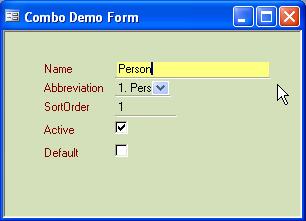
    2. Form Help Field.  Except for the “SPLASH” screen, which is used for logging on, the top left hand corner of fields used for data input have a field with a transparent background and green lettering.  The field has been locked and disabled so that the contents of the field may not be altered and the automatic tab-stop will not stop on this field when tabbing from one field to another on the form.  This field is called the 'Form Help' field.  Every form, where possible in CAFÉ, has a Form Help field.  This tells the user the purpose of the form.
    3. Field Help Field.  In most CAFÉ forms, there is a field across the bottom of the form.  This is the 'Field Help' field.  It tells the user where on the form the cursor is presently focussed, the purpose of the field and the nature of the input expected by (and acceptable to) the program.  The Field Help field, like the Form Help field, is transparent with green lettering.
    4. Using Keys to Navigate aids Clerical Productivity.  A CAFÉ form may be operated either by keystrokes or by using the mouse.  Tests have shown that when a data input operator resorts to a mouse, productivity will drop by as much as 60%.  For that reason, clerks, whose prime role is that of data input, should be trained to use the keyboard as much as possible.  Additionally, it has been found that clerks are fastest operating the number pad, typically on the right hand side of a keyboard.  As a consequence, all CAFÉ menu options and selection options are prefixed by a number followed by a full stop (to disambiguate a list where numbers go beyond 9.) On the form there are visual prompts:
      • “Alt_Q” causes the cursor to focus on the Form Options Menu,
      • “Alt_A” causes the cursor to focus on a particular field,
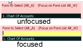
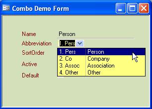
      • “Alt_Z” causes the “main” combo box on a form to drop down revealing its contents with the focus being on that combo box pointing either to the top of the list or to the item that is presently current.
      • “Alt_W” causes the cursor to focus on the list,
      • “Alt_S” causes the focus to go to a Setup option is one exists on the form, and
      • “Alt_X” causes exit from the program if that option   exists on the form that has focus.
    5. Action Keys Selected for Ergonomics.  Keys dThe “Q”, “A”, “Z”, “W”, “S” and “X” are deliberately selected because they are on the left of a QUERTY keyboard.  This frees the right hand to operate the number pad for the purposes of menu or list selection.
    6. Numbers in Options Suffixed by a Full Stop.  As touched upon above, menu options and items in a selection list are prefixed by a number such that the operator, using the number pad, may select a menu option or an item in the list by typing the prefix.  This is because clerks are often proficient in the use of the number pad but not so proficient in using the alpha-numeric keys of a keyboard.  Each number is suffixed by a “.” to disambiguate a list where numbers go beyond 9.
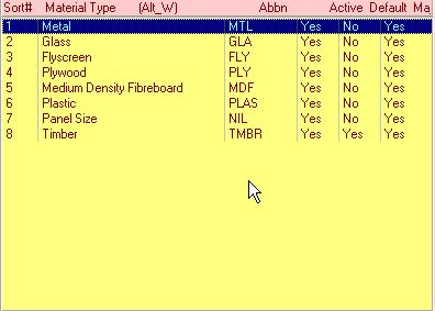
    7. Use of Numbers in Lists.  CAFÉ forms often consist of a list and then a group of fields under the list which contain the details of the item selected in the list.  In the case of the list, the items in the list will have numbers where practical.  Where the list can grow to virtually any length, placing numbers in front of the form may not be practical.  A different form approach is used for long lists and this is described later in this document.  When an item in the list has focus, the program is designed to show the details of the item in the list in the details fields located under the list.  This will be described in greater detail later in this documentation.
    8. Option Numbering Convention.  The form's option menu2 may be in the bottom left or bottom right of the form; depending on the preference of the client.  Where this preference has been expressed, the placing of the form's options menu (and the form help because it typically sits in the space above the form's options menu) should be consistent throughout the program and, where appropriate, the client's site.  As mentioned above, Alt_Q will cause focus to fix on the form's options menu.  Note that the form's options are always prefixed by a number followed by a full stop.  When a clerk causes focus to set on the form's options menu, it is only necessary to type the relevant number to cause that option to be executed.  In the interests of consistency, other rules with the form options are:
      • “0.” is for view mode, ie, you can observe data but can't change it.

      • “1.” is for add mode where you intend to add data to the database.  When 1 is selected, the input fields are cleared, default values are inserted as appropriate and the cursor moves to the first field. 
      • “2.” is for edit where you intend to change data in the database.  When 2 is selected, the focus moves to an item in the list and the details of that item are displayed in the input forms below the list.  If the program has not “remembered” a particular item in the list, the focus goes to the first item at the top of the list.  Using the arrow keys, or by clicking with the mouse, the user may move up and down the list until the item required has focus.  As each item in the list has focus, the fields below fill out accordingly.  By pressing return, the cursor will move from the item selected in the list to the first input field on the form, now filled with the details pertaining to the item.
      • “3” is for deactivate, where deletion is not appropriate, or delete where the data can be deleted without causing “orphan” records somewhere in the database or, through referential integrity, would cause important archival data to be lost somewhere else within the database.
      • “4” to “7” are used for options specific to the form in question.
      • “8.” is used to signify saving changes made on the form. 
      • “9.” is used to close the form and is displayed as “9.  Close”.  “9” is also used for cancelling the transaction and closing the form and is displayed as “9.  Cancel”.
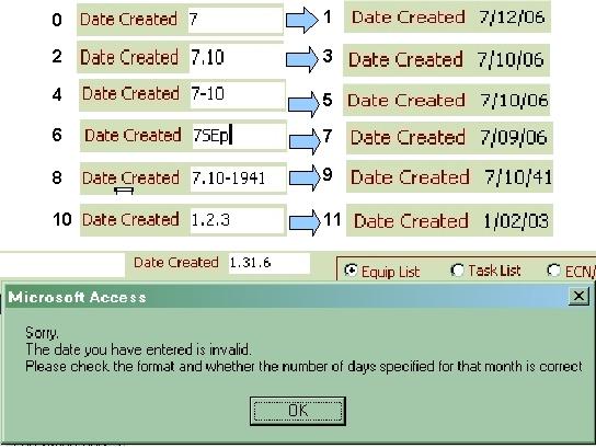
    9. Long Lists Use either Numbers or a Unique String to find SelectionFigure 6 illustrates a form with a long list from which a selection has to be made.  In this situation, there is a field sitting at the top of the long list of options or items into which users may type their selection.  As they type, the program will continuously seek to find a match to the typed string within the list below.  Consequently, if “13.” is typed, it will cause the focus on the list to move to “13.  Material – Colours”.  Similarly, if “AS2” is typed, the focus on the list will change to “4.  Product – AS2047 Ratings”.  This provides a very flexible way by which users may select an option from a long list.  If the user does not wish to type in the field provided at the top of such a list, they may used a pointing deveice (eg, mouse) to click on the item in the list.  This feature demonstrates how CAFÉ deals with long lists of finite length with numbers going beyond “0” to “9”.
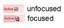
    10. Highlighting the Field that has Focus.  The field where input is expected has a transparent background which turns bright yellow when focus is upon it.  This draws the user's attention to that field.  In the case of Check-Boxes, when they have focus, the border of the box becomes thick and a shadow effect is implemented.  The shadow colour is bright red.  This helps the user identify where the cursor is on the form. 
    11. Labels.  Labels on fields that are mandatory have text that ends with an asterisk.
    12. Check-Boxes.  Check-Boxes may be ticked or unticked by pressing the Space-Bar.
    13. Normally, Only One Form Visible at a Time.  As a general rule, when a form is launched from another form, the launching form is made invisible.  This is done for a number of reasons, the primary motivator being that, in Microsoft Access, having a number of forms open and visible at the same time, each form having a number of controls on it, and each control having a number of events active, will drag the performance of the PC as a whole down to the point of it appearing to “seize” up.  Having been forced to use the stratagem of hiding the “launching” form, it was found that this compels the user to follow a particular course of action, judged by the system designers to be optimal in terms of operator productivity.  It also gives the perception of order and neatness to the user thereby reducing the chances of confusion arising from a cluttered screen. 
    14. Form Modes.  Forms open typically in one of four modes, depending on the purpose of the form, the point in a particular process the user is in or the privileges the user possesses.  The mode a form is in, is displayed in a label above the form options menu.  These modes are as follows:
      • In View Only Mode.  In this mode all fields are locked and disabled.  The user may view the data in the form but cannot change anything.  The menu options available on the form are typically:
        • “0.  View Only” , and
        • “9.  Close”.
      • In View Mode.  This is the mode in which a form opens when it can be edited by the user.  Usually, the menu options on the form are:
        • “0.  View”,
        • “1.  Add”,
        • “2.  Edit”,
        • “3.  Delete”, (may also have “3.  Deactivate”) and
        • “8.  Save”, and
        • “9.  Exit”.
      • In Add Mode.  When a user has selected “1.  Add” from the menu options, the forms fields are unlocked and enabled as appropriate for the particular operation.  Its mode, “In Add Mode”, is displayed just above the form's options menu.  If there is a sorting order for data, the sort order number is incremented, or, in the case of the first item being added, set to 1 and locked so the user cannot change it.
      • In Edit Mode.  When the user has selected “2.  Edit”, the form is placed “In Edit Mode” and those fields subject to edit are unlocked and enabled.  If the edit pertains to a list of item, then focus moves to the list and the details fields on the form are populated according to the item selected in the list.
      • In Delete Mode.  “3.  Delete” may also be “3.  Deactivate”.  In many instances in a relational database, deleting a record can have a ripple-on effect, deleting others that have a referential relationship with that record.  If that doesn't happen, when the record is deleted, there then exists “orphan” records in other tables that use as a “foreign key” the ID of the record that was deleted.  For this reason, records may be deactivated, ie, put into a state where they can no longer be used and will not be visible to users without the correct privilege but, nonetheless, remain in the database.  Other records that have a relationship to this record are also, by definition deactivated when this happens.  In some instances, it is possible to reactivate a deactivated record.  For example, a customer may stop being supported by a business but some time later returns.

Detail Dissection of Form Behaviour

Opening screen of a CAFE compliant document. The LogOn Form.

Figure 7.  Log-in Form
Requiring a Password

  1. Log In Form.  Figure 7 illustrates an example of a Log-in Form.  This is the start of every application.  The purpose of the from is to ascertain the name of the person entering the program for audit purposes with transactions are logged.  Programs have the ability by accessing other files used by the operating system to determine the identity of the PC the person is using and the name used when the PC logged onto the network.  This data is also recorded with every transaction.  In Figure 7 there is a requirement for the operator to use a password.
Log-in Form that does not require a password.

Figure 8.  Log-in Form
Not Requiring a Password

  1. Log-in Form with No Password Required.  Figure 8 provides an example of a Log-in Form that does not require a password.  Note the facility in a Log-in Form to display a business card or logo that identifies the business being served or the nature of the application.  Note also how the login screens for the two different applications look very similar.
Log-in Form after a Password has been correctly entered.

Figure 9.  Log-in Form after correct
Password Entered

  1. Log-in Form after Correct Password Input.  Figure 9 displays the Log-in Form that requires a password after a password has been correctly entered.  Comparing this form to Figure 7, it can be seen that additional fields become visible once the correct password has been given.  These passwords allow users to change their passwords.  There are two fields for the purposes of reducing the chances of an operator inadvertently making a mistake in the typing.  Another field displaying the number of days to go before the password expires can also be shown.  If the password has expired, they must fill in a new one before the form will allow them to progress.
An Example of a 'Flat Form'.

Figure 10.  An Example of a Flat Form

  1. The "Flat" Form.  Figure 10 provides an example of the simplest type of form.  As mentioned previously, forms may open in different “Modes” depending on the point in a process the user is at or the privileges the user may have.  It opens in two modes, one is edit the other is view only.  When in edit there are two possible options.  One is “8.  Save”, the other is “9.  Close”.  Behaviour is as follows:
    1. When “8.  Save” is chosen any changes made to the form are firstly checked to ensure the all mandatory fields have been filled in and the data conforms with database requirements.  The details are saved and the form closes.
    2. When “9.  Close” is chosen, if any fields have been altered, the user is asked to confirm the closing of the form without saving the changes.
An Example of a '1D' Form.

Figure 11.  An Example of a "1D" Form

  1. One Dimensional Form.  Figure 11 displays a form that allows the creation and editing of a list of items.  It's called a "One Dimensional" (1D) form because the list is not one of a number of subsets.  (An example of a 2D form, following on from this, will make this explanation a little clearer.)  This list is displayed on the form.  Points to note are:
    1. Above the list is a field indicating the number of items (records) in the list.
    2. When a form opens it only shows “active” items in a list.
    3. At the top left-hand side of the list is a Check-Box allowing the user to view inactive as well as active items stored in the database table.  Menu Option 5 also allows the user to toggle between viewing only active items or both active and inactive.
    4. As the cursor moves from one item of the list to the next, the details fields are populated according to the list item highlighted or selected.
    5. The list is intended as being a summary.  The details fields provide all of the details of that record and so may include data that is not displayed in the list.
    6.  Each record for the items in the list, besides carrying data fields unique to that particular item, typically have the following common fields:
      • The Table ID.  This is the primary key for that record in the table.
      • The Sort Order.  The sort order is used for the purposes of displaying items in a particular order.
      • The Item Name.  This is the full name of the item.
      • The Item Abbreviation.  This is an abbreviation of the item's name.  Its purpose is for the display of the item in a list where the width is not sufficient to display the item's full name.
      • May Edit.  This is a boolean that indicates whether a normal user may edit this record.
      • Active.  This is a boolean that indicates if the record is active.  This is use where it is not permissible to delete an item from the database because referential integrity would cause other records in other tables, required for archival purposes, to be deleted also.
      • Default.  This is a boolean that indicates the particular record is the default value to display when no other rules apply.  Where a default field does not exist or where no record has a default field marked to true, the item with a sort order of 1 is taken to be the default.
An Example of a '2D' Form.

Figure 12.  An Example of a '2D' Form


An Example of a 'Multi-List Form'.

Figure 13.  An Example of Multiple Lists

  1. Two Dimensional Form.  Figure 12 provides an example of a "Two Dimensional" (2D) form.  It is called a 2D form because the lists are actually subsets of a family.  The combo box at the top of the form stipulates the sub-set of data being displayed in the current list.  The combo box is thus the other “dimension”.  In the example, it can be seen that the combo box has been set to “1.  Metal”.  The list below therefore displays various types of metal.  If the combo box were to be set to, for example, “2.  Glass”, the list would display various types of glass.  The combo box can therefore be viewed as being the 1st Dimension, the list, the 2nd Dimension; hence the term “Two Dimensional” form.
  2. Multi-List Form.  Figure 13 provides an example of a multi-list form.  The list at the top lists the various equipment that have been selected for the purposes of specifying an equipment support “event”.  The list underneath and to the left shows the various equipment events that have already been specified for the equipment, highlighted in the list above.  The list at the bottom right presently displays a list of other equipment to which this particular equipment support event also applies.  Below the two lower lists are a series of radio buttons.  The setting of these buttons determines the nature of the data displayed in the right-hand bottom list.  The effect of these buttons on the data displayed in the right-bottom list is as follows:
    1. Principal Item Equip List Button.  At present the "PI3 Equip List" button is activated.  As explained, this causes the right-hand bottom list to display other Principal Items that also are subject to the particular equipment support event highlighted in the left-hand bottom list.
    2. Task List Button.  When the "Task List" radio button is activated, the tasks that comprise the equipment support event are displayed.
    3. Parts & Materials.  The "Parts Materials" button causes the parts and materials consumed during the conduct of the equipment support event to be displayed.
    4. Special Tools List.  The "Special Tools List" button causes a list of the tools and equipment, necessary to carry out the support event, to be displayed.
    5. Tech Documents.  The "Tech Documents" button causes the list of technical reference documents pertaining to this equipment support event to be displayed.
    6. Audio Visual Instructions.  The "Audio Visual Instructions" button causes the list of audio visual instruction sequences to be displayed.
Figure 14.  An Example of a Long List Form.

Figure 14.  An Example of a
Long List Form

  1. Long List Form.  In many highly developed programs, particularly databases, there is a substantial amount of data necessary for program administration.  Often this data is peculiar to a particular business or operation.  In complex situations it is possible for the form options menu to go beyond 10 possibilities.  The multi-list form in Figure 14 displays such a situation where the user or administrator must set up a particular program.  For example, when an application is first being installed at a particular site, this data might have to be inserted into the database; often by the owners of the business or by the programmer in the case of system specific data.  The forms used for inputting this data are 0, 1 and 2 dimensional as shown in the previous examples.  In the case of these previous example forms, the menu options ran between the numbers “0.” and “9.”.  In the case of a long list, this of course is not practical.  Instead, at the top of the list is placed an input field.  When characters are typed into this field, the program tries to find a string within the various items listed below that matches that which has been typed.  The match is case insensitive.  As a match is found the particular item is highlighted to indicate to the user it has been matched.  The cursor remains in the input field into which text is being typed.  Once the item desired has been highlighted, the user presses “Enter” and this causes the highlighted item to be selected; in this case, launching the form necessary to input the data.
  2. Admin and Run Modes.  The form shown above can be opened in two modes.  “Admin” or “Program Run Mode”.  The facility to open a form in “Admin” mode is useful as it allows the programmer during program development, or initial program installation at a site, set up such things as the form's “Form Help” and “Field Help” plus insert data into the program that the user will never see or, perhaps be aware exists.  For example, the programmer might specify the order of presentation of the items in the forms list when the form opens in “Program Run Mode”, ie, opens as part of normal program running.  When in Admin Mode, other fields on the form become visible.  In “Program Run Mode”, these fields are locked and invisible to the user.
Figure 15.  Text Fields Focused and Unfocused.

Figure 15.  Text Fields Focused and Unfocused

  1. Text Fields. Figure 15 illustrates the appearance of a standard text field when the cursor is not sitting in it (unfocused) and when the cursor is sitting in the field, a condition referred to as "being in focus".  Standard text fields are transparent and have a “chiselled” bottom line upon which text sits once inserted.  When the cursor sits in the field, the background goes to a pale yellow to indicate to the user that the field has focus.  As the cursor moves from field to field on the form, the “Field Help” field at the bottom of the form is updated to inform the user as to the purpose of the particular field.
Figure 16.  Text Field with focus, Combo Box without focus.

Figure 16.  Text Field with focus,
Combo Box without focus

Figure 17.  Combo Box with focus showing abbreviations.

Figure 17.  Combo Box with focus dropped
down showing abbreviations and full name

  1. Combo Box.  Combo Boxes when conforming with the CAFÉ standard behave and present data as follows:
    1. As shown in Figure 16, when the combo box does not have focus it displays the first or the default item in the list and has a transparent background, blending in with the background of the form.  (Note the appearance of the text field with its yellow background, indicating it has focus.)
    2. In Figure 17, when the combo box has focus, it drops down and the background changes to a pale yellow in order to draw the user's eye to that field, indicating the field has focus.
    3. The options in the combo box are numbered.  Generally this is achieved by prefixing the option-name with the “sort order”, a value stored in the table of the database from which the other data is drawn.  The sort order determines the order in which items are presented in the list in the drop-down box.  The number is followed immediately by a “ .”.  The reasoning behind this is based on the fact that clerks operate number pads far faster than they can type alpha-numerically.  The behaviour of a combo box is that it tries to predict the item the user is attempting to indicate.    When the user types, for example, "2.  ", the combo box will immediately highlight the "2.  Co Company" line in the combo box shown in Figure 17.  CAFÉ forms are deliberately constructed such that the left hand is used for navigating around the form, the right hand is used for inputting numbers to select items from drop down boxes.
    4. The combo box not only provides abbreviations but also the full name of the item or at least an elaboration that will make it easier for the operator to know the nature of the item they have selected.  This reduces the requirement for operators to learn codes off by rote and reduces the chances of erroneous selection/input.
Figure 18.  Item List with focus.

Figure 18.  Item List with focus

  1. Item List.  Figure 18 illustrates a typical Item List when it has focus.  Its behaviour is as follows:
    1. The background turns pale yellow to signify it has focus.
    2. Focus is achieved either by “tabbing” from field to field on the form or by pressing Alt_W.
    3. To move up or down the list, the arrow keys may be used.  When at the bottom or the top of the list, further use of the arrow key in the downwards or upwards direction respectively will cause the list pointer to move to the top or bottom of the list respectively.
    4. Pressing the Space-Bar or the Enter-Key when focus is on an item in the list will cause that item to be “selected”.
    5. If “details fields” exist on the form with the list, as the focus moves from item to item in the list, the relevant details for that item are displayed in the details fields.
Figure 19.  Behaviour of a Date Field.

Figure 19.  Behaviour of a Date Field

  1. Date Field.  Figure 19 provides examples of how a date field can be made to be user friendly.  Note that not only is abbreviated input possible, saving on keystrokes and time, but also there is considerable tolerance as to the format the date may be input whilst still ensuring accuracy and a standardised finished product.  Once written, the software routine that provides for this behaviour can be used on every date input field on every form.  The routine ensures that dates may be input in many formats in a convenient and error-free fashion.  It is rare for monolithic ERPs that so characterise applications in large organisation to offer this level of assistance for inputting dates yet dates are an essential aspect of having useful, accurate historical data.  Explanations of the examples are as follows:
    1. Example 0->1 shows the user inputting 7, being the day of the month.  On pressing enter, the program inserts the present month and year (in this case, December 2006).  In forms where a date field is mandatory, ie, it must be filled out, if the user had simply pressed enter, it would have resulted in the present day month and year being inserted. 
    2. Example 2->3 shows how a “.” can be used to delimit the day and month.  Using a “.” for this purpose allows input from the number pad on a keyboard.  Having input “7.10”, the program adds the present year and formats the date as “7/10/06”.
    3. Likewise, example 4->5 uses a “-” as the delimiter between days and months.
    4. Example 6->7 demonstrates the level of flexibility and “forgiveness” of the application when the user inputs “7SEp”.  The program translates this to “7/09/06”.
    5. Example 8->9 demonstrates how “.” and “-” may be used as delimiters in the same date.
    6. Example 10->11 illustrates inputting a day, month and year.
    7. The final demonstration shows what happens when the user inputs and invalid date.  Note the helpful error message.
    8. As a final note, it is possible for the displayed format to be, for example, 7SEP04 (a ddmmmyy format).  This overcomes the problem where US companies will use mm/dd/yy whereas Australian, British and (generally) European enterprises will use dd/mm/yy format.  In some circumstances, when cooperating with US companies, it could be possible to confuse dates with potentially disastrous consequences.
Figure 20.  Icon indicating 'Add/Edit Data'.

Figure 20.  Icon indicating
"Add/Edit Data"


Figure 21.  Example of Checkboxes in an out of focus.

Figure 21.  Example of Checkboxes
in an out of focus

  1. Add/Edit Data Icon.  One of the purposes of having a drop-down list of choices for data input is to ensure there is some level of consistency in the way data is recorded.  In some circumstances, it is possible, if the user has the required privilege, for them to alter a drop down list by adding to or editing its contents.  When this is the case, in CAFÉ, there appears an “Add/Edit/Delete Data” icon at the right-hand end of the combo box as shown in Figure 20.
  2. Check-Box.  A “Check-Box” is a means by which one can indicate “Yes” (a box with a tick in it) or “No” (a box without a tick) on a data input form.  The box toggles between “Yes” and “No” as a result of pressing the Enter-Key or the Space-Bar.  The Enter-Key also causes the cursor to move to the next field.  Pressing the Space-Bar will cause the Check-Box to toggle but the cursor remains focused on the Check-Box.  When the Check-Box has focus, there appears around its edge a dark red border as shown in Figure 21.

SUMMING UP

  1. CAFÉ provides the means by which it is possible to develop a suite of applications to serve the needs of business units whilst retaining a common look and feel across all of these applications, regardless of whether or not they were developed by different programming teams belonging to different contracting companies.  The approach adopted by conventional thinkers has been to reduce the number of different applications running within a business.  This has not only been shown to be impractical, it has resulted in the delivery of systems that do not represent good value for money by any measure whatsoever. 
  2. Having systems that conform to the CAFÉ standard translates to:
    1. minimal training requirements for staff to use forms and therefore the application,
    2. minimal clerical effort to input data and therefore improved clerical productivity, and
    3. freeing staff to concentrate on input and reducing the chances of error thereby improving the quality of data input.
  3. It is not intended that the CAFÉ standard is set in stone.  Instead it is a living thing that will morph to adapt to the needs of every organisation which it serves.  As people find an easier way of doing things or a less ambiguous way of displaying things so the standard will change to take advantage of these new discoveries.  Its importance lies in the fact that it does represent a focal point for discussion and continual improvement yet it also gives stability and a standard.
  4. -End of Paper -

Copyright © NVTech 2005-2011